
From left to right: Kanako Kato, Kota Miyake and Sukeharu Ito

From left to right: Kanako Kato, Kota Miyake and Sukeharu Ito
Miyake: Having a strong desire to work in the creative industry, I studied media design at a vocational school. After graduating, I comprehensively oversaw direction, design and coding at a Web production company. Wanting to challenge myself in an environment with a formidable technological angle, I took up a new job at teamLab, where engineers account for 60% of the company’s members. One of the deciding factors for me joining teamLab was how the company flexibly accommodates my desire to leverage the experience I cultivated at my previous job and concurrently serve as a designer and a catalyst.
Ito: After graduating from high school, I studied graphic design in Australia. Following my graduation from that school, I gained experience at a design office in Kyoto, then took up a new position at a Web production company in Tokyo. In the course of working there, I started thinking how I could probably do even more interesting work as a designer if there were engineers in my work environment. It was then that I had a chance to talk to someone from teamLab, from whom I got the impression that I would find my ideal work environment at this company.
Kato: I enrolled in an art university to pursue my interest in graphic design. While I was there, I engaged in my studies while being mindful of having the ability to approach the nature of design on a fundamental level without emphasizing the type of output involved. That was when I started considering UI/UX design as a potential occupation. Upon my interview with teamLab, it was recommended to me that I become an intern there. I spent a four-week period swamped with assignments and actual work. Along the way, I was recognized for how I tackled my work and for my growth potential, and was subsequently hired as a new graduate.

Nature of duties
Kato: I mostly deal with UI/UX design and graphics for websites, apps, and digital signage. Since I handle a lot of client work, my output is highly varied and includes everything from services to promotion.
Ito: At standard companies, I believe it is common to handle for requirement definition, design and development through division of labor. However, designers at teamLab participate in projects from the planning and conception stages and have involvement in the design of concepts and user experiences.
I devise UX based on the concept at hand together with catalysts*1 and consult with engineers on the UT that I want to realize in order to enhance the quality of my output. The presence of engineers among teamLab members maximizes the possibilities for the UI that can be realized.
*1: At teamLab, “catalyst” is a position that serves to link together specialists with varying skills to manifest their fullest potential as a team. This is befitting of the definition of “catalyst,” which is “someone or something that acts as a stimulus to bring about a result.”
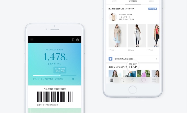
The ".st" app
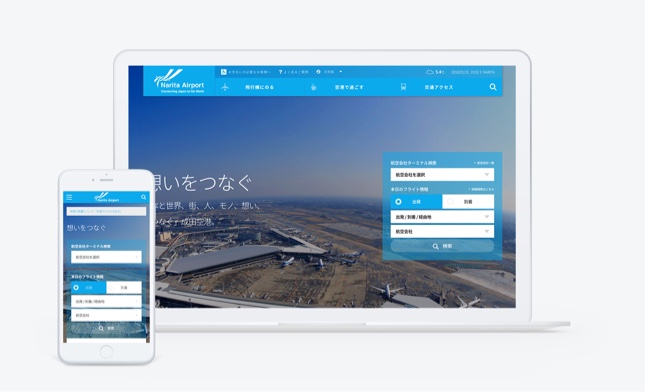
Narita International Airport website and logo redesign

MECHAKARI app branding
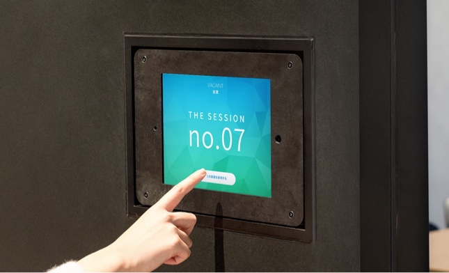
Avex conference room reservation signage
Kato: At teamLab, employees need a skillset that enables them to effectively perform everything from UX design to UI design on their own. As visuals for promotional use and landing pages are produced by designers, in my opinion, having knowledge of graphic design will allow you to successfully contribute to a wide range of projects.
Ito: The importance of designers who also possess a business sense in the process of bringing forth new services is higher than it has ever been. In the end, regardless of how new a service may or may not be, we propose services that will be of benefit to the client. For that reason, designers who are capable of tackling projects with an understanding of marketing, how society works, and its trends, are a potent force. At teamLab, designers participate in nearly all projects from the concept-forming stage. Given that, I’m sure that people who like or are good at talking about business will enjoy working here.
Miyake: I, too, am acutely aware of the need for “a business-like perspective.” Creating output that is only attractive on the surface is a relatively easy task. In our case, though, we have clients, and the services that we design have users. Given that, from the perspective of teamLab’s Design Team, it is ideal for us to aggressively boost our ability to connect the needs of the users with the vision of the client and incorporate mechanisms that enable us to return profits to the client into our designs.
Miyake: Two difficult areas rear themselves when designing UX. The first is that the client occasionally takes a subjective approach to user needs, causing them to adopt something inconsistent with actual user needs as its goal. The second is that sometimes, in the course of discussion, we personally lose sight of the correct answer.
In order to overcome those areas, we prepare a prototype and actually attempt a trial UX. This enables us to identify differences between the UX that we are imagining and the actual experience, concretize issues on the client and service side, and factor them into the solution that we provide. While engaging in discussions with the client, we reconcile both user and client needs, and gradually refine the UI/UX through a repeated process of trial-and-error. The presence of our designers from the initial phase of projects onward is what enables us to pursue design through the flexible process that I just described.
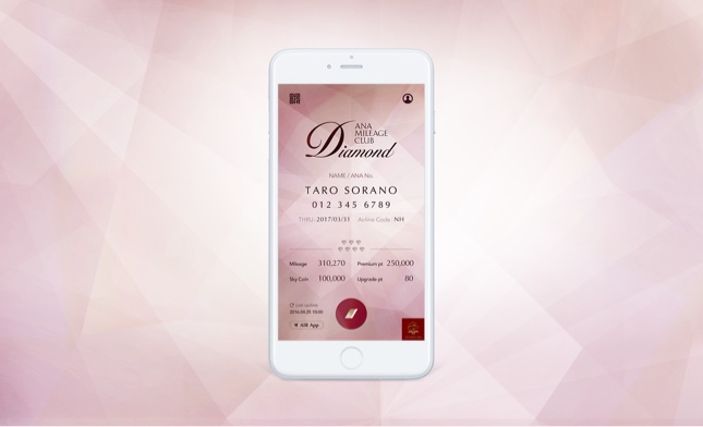
One of the projects that I oversaw was the development of the “ANA Mileage Club App,” a digital version of the ANA Mileage Club member’s card. The goal of this particular project was to compel users to form a stronger impression of the abundance of services being offered. A key element of the project was to steer clear of compromising the appeal that comes from the status that a physical card carries.
At the design stage, I repeatedly brainstormed and created prototypes from multilateral viewpoints. Along the way, a final course of plan of “reproducing the physical texture of an actual card” was decided on. Looking back, I would say that the process consisted less of reaching a consensus with the client and more of working closely with them while mutually presenting our opinions to align the client’s vision with user needs.
Also, something that I am mindful of when approaching design is to have an objective perspective. By regularly making it a point in my daily life to consciously distinguish between subjectivity and objectivity, it becomes possible to keep one’s subjective ideas separate from objective ideas when working. In addition, when there are leading or similar precedents, I experience them myself so as not to lose sight of how users will evaluate my design.
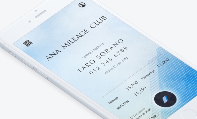
ANA Mileage Club App
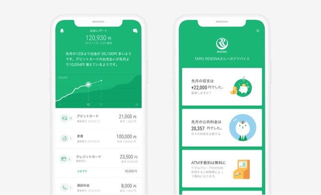
Kato: I oversaw the design for the “Resona Group App.” When requesting this job of us, the client stated that they would provide a new UX for a bank, and that they wanted to create an app that wasn’t bank-like in nature. Following its release, the design won the “Good Design Award.” It seemed that there were no precedents in Japan at the time for an app for a major bank being recognized with an award, and the app was the subject of media coverage as well.
I joined the project from the concept-forming phase, created a design to a certain degree, incorporated it into a mockup, and discussed with our catalysts and engineers what kind of presentation would be the most ideal.
The UI for financial institution apps tend to be loaded with functions and complexity. This is especially true in Japan. A UI that is simplified and made easy to use can enjoy tremendous differentiation. Plus, the varied nature of user needs also required us to make an app that any user could navigate with ease.
A particular topic of discussion was the composition of the top screen. There are numerous types of bank transactions. Equally numerous are people’s motivations for using a bank app. The question of what elements we should display on the top screen was discussed endlessly, and we vacillated between a list of financial transactions and ordinary savings particulars. After conducting user research, a truly varied set of user needs came to the forefront. Following an examination of new, unprecedented bank experiences based on that research, we arrived at the conclusion to use “a top screen that is personalized according to the state of usage by the user.”
With this project, we successfully created a “UI in close proximity to the lifestyles” of users. I learned a lot along the way, and I also felt a sense of accomplishment in “managing to design a new bank experience,” which I am pleased about. I reaffirmed how the presence of designers, catalysts and engineers from the concept-forming stage and our ability to carry out the project with a concept that we can share as a team at its center is precisely the reason why we were able to incorporate that concept into a satisfactory design.
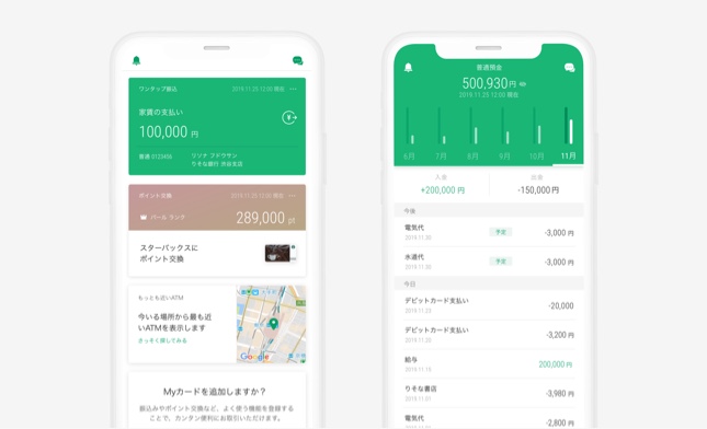
Resona Group app
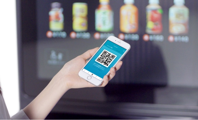
Ito: Having the mindset to question what is considered a given is of the essence. One example is “acure pass,” a product and service produced by teamLab consisting of a dedicated app for the “innovation vending machines” located inside JR East Japan station buildings. The interface of vending machines went unchanged for decades. While people might tend to attribute this to many people being satisfied with the status quo, the client wanted us to infuse that area with innovation.
We reinforced functions linking the vending machines to signage and the app to realize the first subscription service for vending machines, and also turned our attention to the data element on the back end. As vending machines up to that point had been analog, data on what kind of customers made purchases, what they purchased and when and where they purchased it could not be collected. We used digital means to conduct the intensive management of product inventory at each vending machine, and made it possible to obtain data in real time.
Such ideas are the collective product of our designers, engineers and catalysts. In actuality, the lines defining what a designer’s job is might be fairly ambiguous.
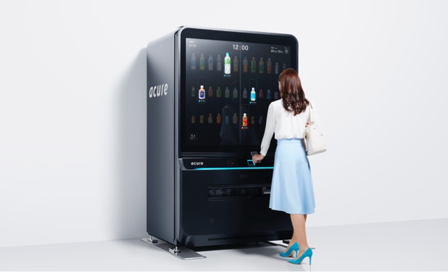
acure pass
Ito: Many of our projects involve a considerable scale, and we are able to gain a real sense of the work we have done reaching others. While that involves considerable pressure, it also comes with an unmatched sense of accomplishment.
Kato: Many of teamLab’s clients consist of those who say to us, “We want to make ‘something new’, and want to come up with that ‘something’ together.” While this means one challenge after another, for people who want to bring forth something new, I believe it to be the very best environment.
Miyake: Our designers join projects from the stage of examining the challenges that clients face. I derive satisfaction from the extended process of identifying challenges that differ every time from client to client and coming up with designs for resolving those challenges.